
Hotel factsheet Redesign for
Costco Travel
OVERVIEW
Costco Travel offers its members everyday savings on top-quality, brand-name vacations, hotels, cruises, rental cars, and experiences. The company is going through a major site redesign, along with updating the design system. We will be focusing on the Hotel factsheet, an important step in the booking process of vacation packages for our members.
I was handpicked to drive this redesign. While crafting the end-to end experience of hotel description, I focused on ease of discovery, organization and relevance of the hotel information. This redesign provided me the opportunity to work in collaboration with stakeholders, technical product manager, business product manager, UX manager and the engineers.
Project Details
My Role
UX-UI Designer
Tools
Figma, User Testing
Timeline
Jul 2024 - Sep 2024
Deliverables
High-fidelity prototype, ideations, usability tests
BACKGROUND
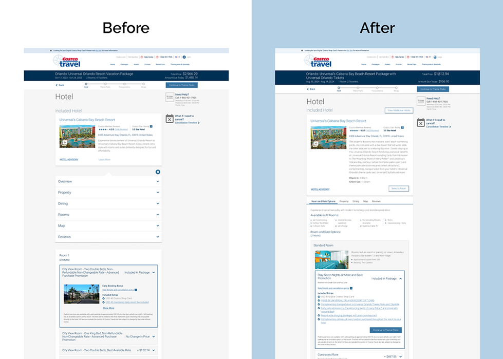
Previous version of this hotel fact sheet had crucial hotel information like property features, amenities, dining places, map, reviews, all hidden as dropdowns concealed within a “Learn More” link. The goal of this enhancement was to highlight the rooms and rates offered by the hotel and to bring all the hotel information to the foreground, improving its discovery and accessibility.

USABILITY CHALLENGES
A benchmarking study was conducted with 55 users to evaluate the whole workflow of booking a Vacation Package that included selecting round-trip flights, hotel, rental car and transfers, theme park tickets and activities.
1. Poor find-ability of important hotel information
44 out of the 55 users were unable to find the "Learn more" link and were surprised to learn that important information about property and on-site parking availability lived under "Property" accordion. 9 out of those 44 users also mentioned that hard -to-find property information makes them more likely to call customer service and/or visit the hotel site directly.
"Why is it even a link... and its called Learn More. That was not easy to find, by the way. I had to really dig for that because I opened the (modify rooms) option and was trying to find it there."
- Participant 55
2. Room features and rates were shown separately
The other challenge that members faced was that the different types of rooms and its description was in the “Learn More” link and not shown together with the rate information. This resulted in members feeling lost and cheated when they could not find the room details for comparison. 25 out of 29 users said that they needed to consult room descriptions and rates together to make informed room comparisons without having to use “Learn More” link.
"I think its easier if room descriptions are next to rate details. If I'm trying to compare rooms, it'll be easier."
-Participant 22
DESIGN SOLUTION
Browse all hotel information without getting lost
For the redesign of hotel fact sheet, we needed to expose all hotel information like room and rate options, property features and amenities, dining places, map, reviews on the page and give them their designated space. A tab navigation bar at the top helped members switch between sections of the hotel info without the need for scrolling.


Prioritize information related to property
All the property related information on the page was reorganized as per members’ priority and feedback for better discovery, better use of digital real estate and to match the industry standard experience.

Find room information with the rates
As seen earlier with the benchmarking studies, our members found that when the room information was shown separately from the rates, it was difficult to compare the rooms. It just made sense to combine the room information with their rates for them to easily compare the room offerings and make their best selection.

MEMBER FEEDBACK
We had a very successful usability testing session with our members. 100% of the users were able to find the hotel information confidently. This meant that the new design increased the perceived discoverability of information by 25%. 88% of the members found the new design easier to use and the time on task was reduced by 56%.